

Why image optimization is crucial
Images are the single biggest factor influencing a website's loading time. According to the HTTP Archive, images account for an average of...50% of the total page weightoff — for image-heavy pages such as portfolios, e-commerce or real estate, even up to 75%.
This has a direct impact on your business:
- 53% of usersUsers abandon a mobile page that takes longer than 3 seconds to load (Google study)
- Every additional second of charging time reduces theConversion rate by 7%(Akamai)
- Google uses theCore Web Vitals— especially LCP (Largest Contentful Paint) — as a ranking factor
- Slow pages have ahigher bounce rateand shorter stay
In our daily work asWeb design agency in ViennaWe see the same thing time and again: Companies invest thousands of euros in a beautiful design, but upload 5 MB images directly from the camera. The result: A gorgeous website that nobody sees because it loads too slowly.
The numbers speak for themselves.
| Metric | Without optimization | With optimization | Improvement |
|---|---|---|---|
| Page weight | 8–15 MB | 1–3 MB | 70–80 % |
| Charging time (3G) | 12–25 seconds | 3–5 seconds | 60–75% |
| LCP Score | > 4 s (poor) | < 2.5 s (good) | Core Web Vital passed |
| Bounce rate | 45–65% | 20–35% | 25–40% less |
|---|
| PageSpeed Score | 30–50 | 85–100 | Significant improvement |
|---|
If you want to upgrade your website with ourWebsite design toolBy testing, you will quickly see if images pose a problem. In most cases, image optimization is thefastest way to better Core Web Vitals— often the PageSpeed score can be improved by 20–40 points simply through image optimization.
Performance and SEO are related
In 2021, Google officially introduced Core Web Vitals as a ranking factor. This means that slow-loading images not only cost you visitors, but also...Search engine rankingsThe LCP score, in particular, is often determined by a large hero image or banner. If this image is not optimized, your entire page will fail the LCP test.
Learn more in our detailed guide toOptimize Core Web Vitals.
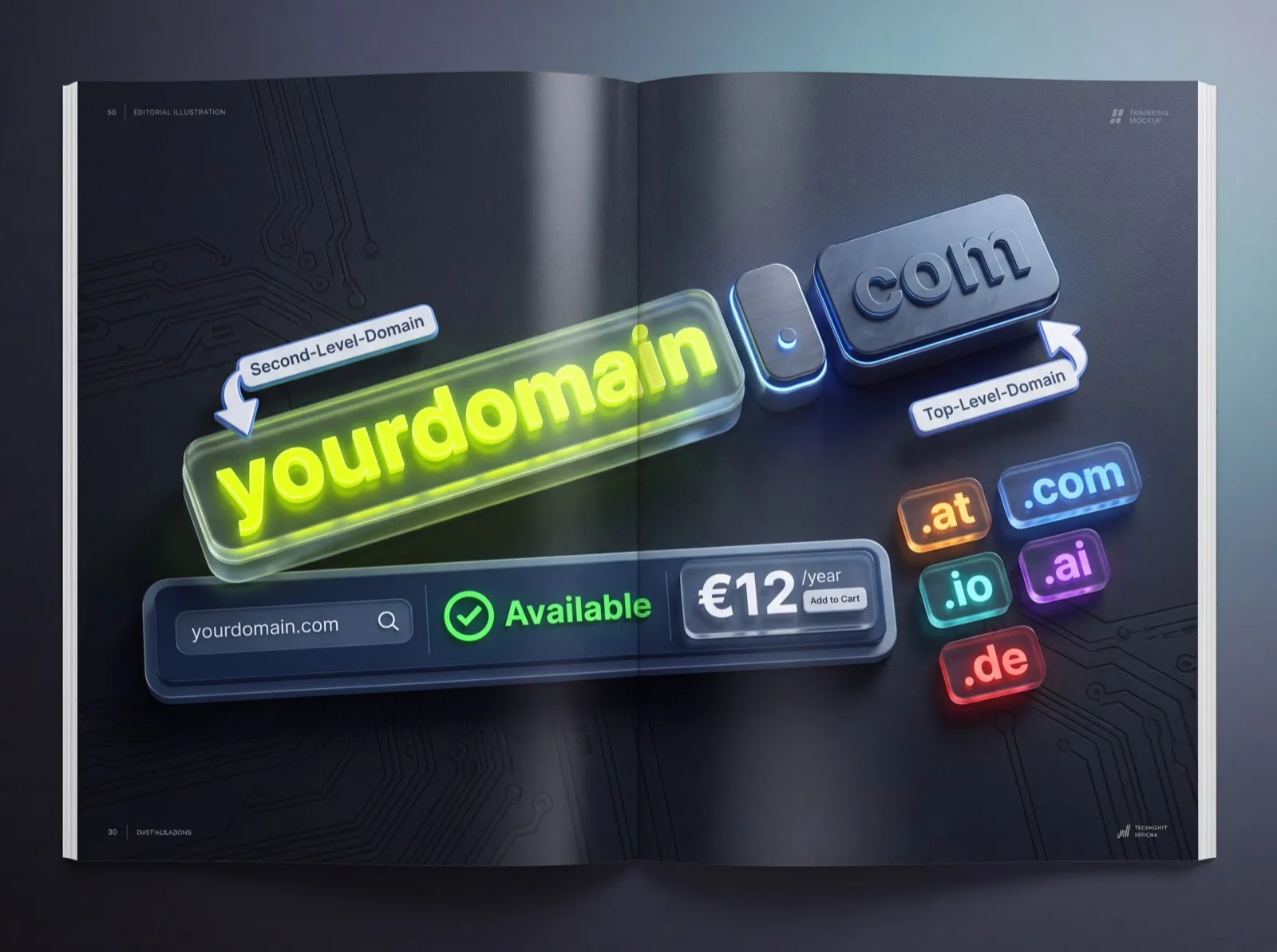
Image formats compared: WebP, AVIF, PNG, JPG, SVG
Choosing the right image format is the first and most important step in image optimization. Each format has its strengths and weaknesses — and its ideal use case.
JPEG (JPG) — The classic
JPEG has been the standard format for photos on the web for over 30 years. It useslossy compression— this means that minimal details are lost every time you save.
Advantages:
- Universal browser support (100%)
- Good compression for photos
- Small file size with acceptable quality
Disadvantages:
- No transparency
- Quality loss with multiple saves
- Not ideal for text, graphics, or sharp edges.
- Larger than WebP at the same quality
Best Practice:JPEG quality on75–85%The difference to 100% is barely noticeable to the naked eye, but the file size decreases by 50–70%.
PNG — For transparency and graphics
PNG is usedlossless compressionand supports transparency (alpha channel). This makes it ideal for logos, icons, and graphics with text.
Advantages:
- Lossless quality
- Transparency (Alpha channel)
- Ideal for graphics, screenshots, text
Disadvantages:
- Significantly larger files than JPEG or WebP for photos
- No animation (APNG is for that)
Best Practice:Use PNG only for graphics with transparency or sharp edges. PNG is almost always the wrong choice for photos.
WebP — The modern standard
WebP was developed by Google and offers25–35% smaller filesas JPEG at comparable quality. It supports both lossy and lossless compression as well as transparency.
Advantages:
- Significantly smaller files than JPEG and PNG
- Transparency support
- Lossy and lossless compression
- 97% browser support(As of 2026)
Disadvantages:
- Older Safari versions (< 16) do not support WebP
- Quality loss is more noticeable at very low quality levels than with JPEG.
Best Practice:WebP asStandard formatUse for all photos and complex graphics. Offer JPEG as a fallback in the picture element.
AVIF — The Future
AVIF is the latest image format and is based on the AV1 video codec. It offers aup to 50% better compressionthan JPEG and also significantly surpasses WebP.
Advantages:
- Best compression of all current formats
- HDR and wide color gamut support
- Transparency and animation
- 92% browser support(As of 2026)
Disadvantages:
- Longer encoding time (CPU intensive)
- No universal support yet.
- Maximum image size is limited on some encoders.
Best Practice:AVIF asFirst Choicein the picture element, WebP as a fallback, JPEG as a last resort.
SVG — For vector graphics
SVG is a vector-based format thatinfinitely scaledNo loss of quality. Perfect for logos, icons, illustrations, and diagrams.
Advantages:
- Infinite scalability
- Extremely small file sizes for simple graphics
- CSS-animable and JavaScript-manipulable
- Text-based — ideal for SEO
Disadvantages:
- Not suitable for photos
- Complex SVGs can become very large.
- Security risks with user uploads (embedded JavaScript)
The large comparison table
| Format | Compression | Transparency | Animation | Browser Support | Ideal for |
|---|---|---|---|---|---|
| JPEG | Lossy | No | No | 100% | Photos (Legacy) |
| PNG | Lossless | Yes | No (APNG) | 100% | Graphics with transparency |
| WebP | Both | Yes | Yes | 97% | Photos and graphics (standard) |
| AVIF | Both | Yes | Yes | 92% | Photos (best quality per size) |
| SVG | Vector | Yes | CSS/SMIL | 100% | Logos, icons, illustrations |
| GIF | Lossless (256 colors) | Yes (1-bit) | Yes | 100% | Simple animations (avoid) |
GoldenWing's recommendation:Use thepicture elementwith AVIF, WebP and JPEG as a fallback chain. This ensures that all users automatically receive the best possible version.
Implementing Responsive Images Correctly
Loading a 4K hero image onto a smartphone is a waste of resources.Responsive Imagesensure that each device receives only the appropriate image size.
The srcset attribute
With srcset you define different image sizes, and the browser automatically selects the appropriate one:
<img
  src="hero-800.webp"
  srcset="hero-400.webp 400w,
          hero-800.webp 800w,
          hero-1200.webp 1200w,
          hero-1600.webp 1600w"
  sizes="(max-width: 600px) 100vw,
         (max-width: 1200px) 50vw,
         33vw"
  alt="Modern web design portfolio on different devices"
  loading="lazy"
/>
Explanation:
- srcset lists available image widths
- `sizes` tells the browser how wide the image will be in the layout.
- The browser automatically calculates the optimal image size (taking pixel density into account).
The picture element for format fallbacks
The picture element combines format selection with responsive sizes:
<picture>
  <source type="image/avif"
    srcset="hero-400.avif 400w, hero-800.avif 800w, hero-1200.avif 1200w"
    sizes="(max-width: 768px) 100vw, 50vw" />
  <source type="image/webp"
    srcset="hero-400.webp 400w, hero-800.webp 800w, hero-1200.webp 1200w"
    sizes="(max-width: 768px) 100vw, 50vw" />
  <img src="hero-800.jpg" alt="Responsive web design project"
    width="1200" height="630" loading="lazy" decoding="async" />
</picture>
We use this pattern whenall web design projects, to ensure maximum performance with the best image quality. A basic understanding ofResponsive Designis essential in this regard.
Which image sizes should be generated?
For most websites, we recommend the following breakpoints:
| Use | Image widths | Suitable for |
|---|---|---|
| Thumbnails | 150, 300 px | Preview images, map views |
| Content images | 400, 800, 1200 px | Blog images, products |
| Hero/Banner | 800, 1200, 1600, 2000 px | Full-width header images |
| Background | 1200, 1920, 2560 px | Fullscreen backgrounds |
Tip:Do not generate more than 4-5 variants per image. Each additional variant costs storage space and build time, but offers diminishing benefits.
Lazy Loading: Images are only loaded when needed.
Lazy loading delays the loading of images until they become visible in the viewport. This reduces theinitial loading time drastically reduced, especially on long pages with many images.
Native Lazy Loading (the simple solution)
Since 2020, all modern browsers have supported native lazy loading via the loading attribute:
<!-- Images below the viewport -->

<img src="image.webp" loading="lazy" alt="Description" width="800" height="450" />

<!-- Hero image: DO NOT load lazy! -->

<img src="hero.webp" loading="eager" fetchpriority="high" alt="Hero" width="1600" height="900" />
Important rules:
- Above-the-fold imagesalways loading="eager" or no loading attribute at all
- LCP imageadditionally set fetchpriority="high"
- Always width and heightSpecify to avoid layout shifts (CLS)
- No lazy-loading librariesMore is needed — a native solution is sufficient.
Intersection Observer (for special cases)
If you need more control (e.g., for background images or video posters), use the Intersection Observer:
const observer = new IntersectionObserver((entries) => {
  entries.forEach(entry => {
    if (entry.isIntersecting) {
      const img = entry.target;
      img.src = img.dataset.src;
      observer.unobserve(img);
    }
  });
}, { rootMargin: '200px' });

document.querySelectorAll('img[data-src]').forEach(img => observer.observe(img));
The root margin of 200 px ensures that images200 pixels beforeThey become visible when loaded — so the user never sees a blank image.
Placeholder strategies
No empty space should appear while an image is loading. The best strategies:
- Blur-Up (LQIP):A tiny, blurry preview image (under 1 KB) that is replaced by the sharp image upon loading. The Next.js Image Component does this automatically.
- Dominant Color:Background color of the image used as a placeholder. Quick to calculate, visually pleasing.
- Skeleton Loading:Animated grey placeholder shapes. Modern and familiar from social media apps.
At GoldenWing, we focus onBlur-Up with Next.js Image, which offers the ideal combination of performance and UX. This is a key component of ourWeb app development.
CDN for images: Cloudflare, imgix, Cloudinary
A Content Delivery Network (CDN)It stores your images on servers worldwide and delivers them from the nearest location. Specialized CDNs exist for images, offering additional automatic optimization.
Cloudflare Polish and Image Resizing
Cloudflare is already used as a CDN for many websites. Image optimization is available as an additional feature.
- Polish:Automatic compression of all images (lossless or lossy)
- WebP conversion:Automatically for supported browsers
- Image Resizing:On-the-fly image resizing via URL parameter
- Price:Included in the Pro plan ($20/month)
Advantage:No code changes are needed — Cloudflare optimizes all images automatically.
Cloudinary — The All-Rounder
Cloudinary offers the most comprehensive image transformations of any provider:
- Automatic format detection (f_auto delivers AVIF/WebP/JPEG depending on the browser)
- Automatic quality (q_auto selects the optimal quality)
- Responsive breakpoints are generated automatically.
- AI-based cropping (g_auto recognizes the subject)
Price:Free Tier with 25 credits/month, then from $89/month.
imgix — For Enterprise
imgix is the premium provider for image-intensive websites:
- Extremely fast processing
- Over 100 URL parameters for transformations
- Automatic format detection
- Excellent documentation
Price:Starting at $100/month, calculated based on Origin images.
Which CDN is right for you?
| Criterion | Cloudflare | Cloudinary | imgix |
|---|---|---|---|
| Price (Entry) | $20/month | $0 (Free Tier) | $100/month |
| Automatic formats | Yes (WebP) | Yes (AVIF, WebP) | Yes (AVIF, WebP) |
| Transformations | Limited | 100+ | 100+ |
| Simplicity | Very simple | Medium | Medium |
| Ideal for | Small/medium sites | All sizes | Enterprise |
For most of our customers, we recommendCloudflareas CDN plusNext.js Image Optimizationfor responsive images. We only use Cloudinary for very image-heavy projects (e-commerce, photography).
Alt text SEO optimization
Alt text is doubly important: it creates images forScreen reader accessibleand help search engines understand the image content. Nevertheless, they are neglected on most websites.
What Google says about alt text
Google uses alt text to:
- The Image content to understand
- Images in theGoogle Image Searchto index
- The Context of the pageto better understand
- Featured Snippetsto select with images
Rules for perfect alt text
- Describe what can be seen in the picture.— not what you wish for
- Integrate keywords naturally.— no keyword stuffing
- Stick to 80–125 characters.— precise, but complete
- No empty phraseslike "Image of..." or "Photo shows..." — screen readers already announce "image".
- Decorative PicturesReceive an empty alt="" (do not omit the alt attribute!)
Good vs. bad alt texts
| Bad | Good |
|---|---|
| "" (missing) | alt="" (for decorative images) |
| "image1.jpg" | "Responsive web design on laptop and smartphone" |
| "Web design Vienna agency web design prices" | "Team meeting at GoldenWing Vienna for website planning" |
| "Image from a website" | "E-commerce website for a fashion shop with product filters and shopping cart" |
Good alt texts are an integral part of ourSEO content strategyWe optimize them as part of every web design project.
Alt text audit: How to find missing alt text
Use one of these tools to check your website for missing or empty alt text:
- Google Lighthouse:Displays missing alt text directly in the accessibility audit.
- Screaming Frog:Crawls all images and lists missing alt text.
- WAVE Browser Extension:Visual accessibility check directly in the browser
Core Web Vitals and Images
The Core Web VitalsThese are Google's metrics for user experience. Images directly influence two of the three metrics.
LCP (Largest Contentful Paint) — The most common problem case
The LCP measures how long thelargest visible elementwhat's needed to load. In over 70% of cases, this is an image (hero image, banner, product photo).
LCP optimization for images:
- Preload the LCP imagewith a link tag in the head
- No lazy loadingfor the LCP image
- fetchpriority="high"place on the LCP image
- Minimize image size:Use WebP/AVIF, set quality to 75–85%
- Use CDN:Load images from the nearest server
- Inline Critical CSS:Avoid render-blocking stylesheets in front of the LCP image.
CLS (Cumulative Layout Shift) — Jumping layouts
CLS measures how strongly elementsmove during loadingImages without a defined size are the most frequent cause.
CLS optimization for images:
- Always specify width and height(or aspect ratio via CSS)
- CSS aspect ratio as a modern alternative: aspect ratio: 16/9
- Use placeholders(LQIP, Dominant Color) to reserve a space
- Do not insert images later, which move the content
Ideal CWV values
| Metric | Good | Needs Improvement | Bad |
|---|---|---|---|
| LCP | < 2.5 s | 2.5–4 s | > 4 s |
| CLS | < 0.1 | 0.1–0.25 | > 0.25 |
| INP | < 200 ms | 200-500 ms | > 500 ms |
Read the full guide:Optimize Core Web Vitals.
Batch optimization for large websites
For websites with hundreds or thousands of images, manual optimization is not an option. Here you need...automated processes.
Command-line tools
Sharp (Node.js):The fastest image processing tool for Node.js:
const sharp = require('sharp');
const glob = require('glob');

const files = glob.sync('images/**/*.{jpg,jpeg,png}');
for (const file of files) {
  const outputWebp = file.replace(/\.(jpg|jpeg|png)$/, '.webp');
  await sharp(file)
    .resize(1600, null, { withoutEnlargement: true })
    .webp({ quality: 80 })
    .toFile(outputWebp);
}
ImageMagick:Proven tool for batch processing:
for f in *.jpg; do
  cwebp -q 80 "$f" -o "${f%.jpg}.webp"
done
Build pipeline integration
For Next.js projects (like the ones we use atdeploy GoldenWing) we recommend theNext.js Image Component, which automatically converts images to WebP/AVIF, generates responsive variants, implements lazy loading, and creates blur-up placeholders.
For WordPress sites, there are plugins like ShortPixel or Imagify that can optimize all existing images in a batch (see also ourWordPress SEO Guide).
Optimization checklist for large websites
- All images converted to WebP (and AVIF where possible).
- Maximum image width limited to 2000 px
- Responsive source code for all content images
- Lazy loading for all below-the-fold images
- LCP image with preload and fetch priority = high
- Alt text for all informative images
- width/height or aspect ratio for all images
- CDN configured for global delivery
- Automatic optimization during the upload process
- Regular audits with PageSpeed Insights
Image compression: Optimally balancing quality vs. file size
Image compression is a balancing act: Too much compression leads to visible artifacts, too little compression to unnecessarily large files. In this section, we'll show you how to find the optimal middle ground.
Lossy vs. lossless compression
When it comes to image compression, we generally distinguish between two approaches:
Lossless compression:
- Reduces file size without loss of quality
- Typical savings: 10–30%
- Formats: PNG (with optimization tools), WebP Lossless, AVIF Lossless
- Ideal for: Logos, icons, screenshots, graphics with text
Lossy compression:
- Removes image information that the human eye can barely perceive.
- Typical savings: 50–90%
- Formats: JPEG, WebP Lossy, AVIF Lossy
- Ideal for: Photographs, wallpapers, hero images
Finding the optimal quality level
Based on our experience with hundreds of web projects, the following quality levels have proven to be the optimal compromise:
JPEG/WebP quality settings:
- Hero images and header bannersQuality 80–85% — these images are displayed large and artifacts are quickly noticeable.
- Content images within the textQuality 70–80% — a good compromise for most applications
- Thumbnails and preview imagesQuality 60–70% — at small sizes, quality differences are hardly visible
- Background images with overlayQuality 50–65% — if there is a text overlay or color gradient over the image, the quality can be significantly reduced.
AVIF quality settings:
AVIF offers files that are approximately 30–50% smaller than WebP while maintaining the same visual quality. The quality settings are therefore slightly different:
- Hero ImagesQuality 65–75%
- Content imagesQuality 55–65%
- ThumbnailsQuality 45–55%
Perceptual Quality Metrics
Instead of blindly relying on percentages, we recommend using perceptual quality metrics. These measure perceived quality from the perspective of the human eye:
- SSIM (Structural Similarity Index)Values above 0.95 are considered visually identical to the original. Target: at least 0.90 for content images.
- DSSIM (Structural Dissimilarity): The inverse of SSIM — values below 0.015 are barely perceptible.
- ButteraugliDeveloped by Google, it measures the perceived difference in quality. Values below 1.0 are considered imperceptible.
Tools such asSquooshGoogle's squoosh.app allows you to visually compare quality while simultaneously monitoring file size. For batch processing, we recommend...Sharp(Node.js) orlibvips, both of which support SSIM-based car quality.
Practical workflow for optimal compression
Here is our recommended workflow for image compression:
- Prepare the starting imageAlways start with the highest possible quality (RAW or uncompressed TIFF/PNG)
- Adjust sizeScale the image to the maximum required resolution (e.g., 1920px width for full-width images)
- Choose formatPhotographs → WebP/AVIF, Graphics → PNG/SVG
- CompressStart at 80% quality and gradually reduce it until artifacts become visible.
- CheckCompare the original and compressed versions at 100% zoom.
- Create responsive variantsGenerate different sizes (320, 640, 960, 1280, 1920px)
Automated image optimization in CI/CD pipelines
Manual image optimization is error-prone and time-consuming. For professional web projects, we recommend integrating image optimization into the automated build process.
Why automated image optimization?
In a typical web project, images are uploaded by various people—editors, designers, developers. Without automated optimization, the following happens:
- An editor uploads a 5MB JPEG directly from the camera.
- A designer exports a PNG at 300 DPI instead of 72 DPI.
- A developer forgets to create responsive versions.
The result: inconsistent image quality and unnecessarily large files. An automated pipeline prevents these problems.
Build-time optimization with Sharp
Sharpis the fastest Node.js library for image processing and is based on libvips. Here's an example of a build-time pipeline:
Configuration example
A typical setup in a Next.js application uses the integrated image optimizer, which employs Sharp in the background. The configuration in next.config.js allows for centralized control of formats (WebP, AVIF), quality levels, and device sizes.
For static websites, we recommend a build script using Sharp that performs the following steps:
- Scan all images in the source folder
- Create responsive variants (e.g. 640, 960, 1280, 1920px)
- Generate WebP and AVIF versions
- Automatically optimize quality(SSIM-based)
- Write results to an output folder
CMS-based optimization
When images are uploaded via a CMS (WordPress, Payload, Strapi), optimization should be performed server-side:
WordPress:
- ShortPixel or ImagifyCompress images automatically on upload
- WebP ExpressGenerates WebP variants on-the-fly
- Cost: from approximately €5/month for 5,000 images
Payload CMS (our standard):
- Integrated image optimization via Sharp
- Automatic generation of responsive variants via the imageSizes configuration
- WebP conversion via custom hooks is possible.
Headless CMS (Contentful, Sanity, Cloudinary):
- These services offer image CDNs with automatic optimization.
- URL parameters control format, quality, and size
- Cloudinary in particular offers extensive transformation possibilities.
Monitoring and quality assurance
After implementing an automated pipeline, you should regularly review the results:
- Lighthouse CIIntegrate Lighthouse into your CI/CD pipeline to automatically detect performance regressions.
- Bundle size/Size limitSet size limits for images and make the build fail if an image exceeds the limit.
- Visual Regression TestingTools like Percy or Chromatic compare screenshots and detect visual changes caused by overly aggressive compression.
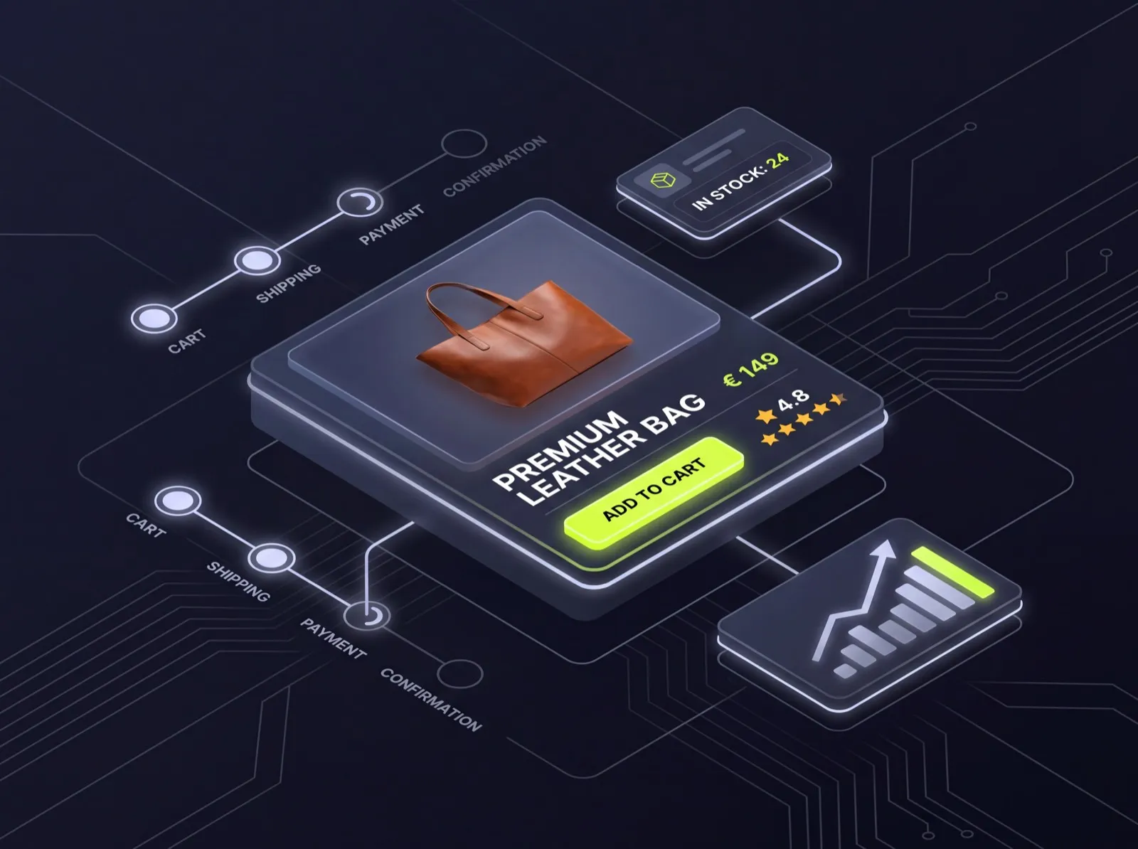
Image optimization for e-commerce: Perfectly displaying product photos
In e-commerce, images are the most important conversion factor. Studies show that75% of online shoppersConsumers consider product images crucial to their purchasing decisions. At the same time, the images must load quickly, as every second of delay reduces the conversion rate by approximately 7%.
Product image requirements by platform
Different sales channels have different requirements for product images:
Own online shop (WooCommerce, Shopify, Medusa):
- Main image: at least 1200 × 1200 px (for zoom function)
- Background: pure white (#FFFFFF) or transparent (PNG)
- At least 3-5 images per product (different angles, details, lifestyle)
- File size: under 200 KB per image after optimization
Amazon Marketplace:
- Main image: at least 1000 × 1000 px, pure white background
- RGB color space (no CMYK)
- Maximum 10 MB per image (JPEG, PNG, GIF, TIFF)
- The product must fill at least 85% of the image area.
Google Shopping:
- At least 100 × 100 px (clothing: 250 × 250 px)
- No watermark, no advertising text in the image
- High-quality product photos without distracting elements
- Supported formats: JPEG, PNG, GIF, BMP, TIFF
Zoom functionality and high-resolution images
A zoom function increases the conversion rate by up to...30%, as customers can see details such as material structure, seams, or texture. For a good zoom experience, you need:
- Minimum resolution: 2000 × 2000 px for 2× zoom
- Recommended: 3000 × 3000 px for 3× zoom
- formatWebP with 85% quality (reduces file size by 50–70% compared to JPEG with the same visual quality)
- Lazy Loading: Zoom images only load when the user activates the zoom function.
- Progressive Loading: Display a low-resolution preview image immediately, then load the high-resolution image in the background
360-degree views and product videos
Advanced e-commerce shops rely on 360-degree views, allowing customers to examine the product from all sides. Optimization is particularly important here:
- Number of frames24–36 images for a smooth 360-degree rotation
- File size per frame: maximum 50–80 KB (WebP, quality 70%)
- Overall sizeIdeally, the file size should be under 2 MB for all frames.
- Preloading strategyLoad the first 4-8 frames immediately, the rest only upon interaction.
Product videos should be provided as MP4 (H.264) files in various quality levels. Use the HTML5 video element with the poster attribute to display an optimized still image before the video loads.
Schema markup for product images
Structured data helps Google display your product images correctly in search results. Use the Product Schema with the following image-related properties:
- image: URL of the main product image (at least 1 image required, up to 5 recommended)
- additionalImageURLs of other product images
- Use absolute URLs and ensure that the images are crawlable (not blocked by robots.txt).
Accessible images: More than just alt tags
Image accessibility goes far beyond alt text. With the implementation of the Accessibility Strengthening Act (BStG) in Austria, this issue becomes a legal obligation for many companies.
How to write alt text correctly
Alt text is the most important accessibility measure for images, but it is frequently used incorrectly. Here are the rules:
Informative images(Photos, illustrations with content):
- Describe theContent and purposeof the image
- Be precise, but not too long (80–125 characters are optimal)
- Avoid "Image of..." or "Photo shows..." — screen readers already announce "image".
- Bad: "Picture of team" — Good: "Five web designers working together on a project board in the Vienna office"
Decorative Pictures(Backgrounds, dividing lines, decorative elements):
- Use aempty alt text(alt="")
- This signals screen readers to ignore the image.
- Even better: Insert the image as a background image using CSS, then you don't need any alt text.
Functional Images(linked images, image buttons):
- The alt text describes thefunction, not the image
- Bad: "Red arrow" — Good: "Go to the next project"
- For linked logos: "Go to GoldenWing's homepage" instead of "GoldenWing Logo"
Complex images(Diagrams, infographics, charts):
- The alt text provides aBrief descriptionof the content
- Additionally: A detailed text description in the surrounding content or via aria-describedby
- Example: Alt text "Bar chart: Website loading times by CMS" + detailed data table below
Optimize image descriptions for screen readers
Besides alt text, there are other techniques to make images accessible to screen reader users:
Figure and Figcaption:
Use the HTML element `figure` with `figcaption` for images with captions. Screen readers read both the alt text and the caption aloud—make sure the content complements the existing text and doesn't repeat itself.
Aria-describedby for complex descriptions:
For infographics or diagrams, you can use aria-describedby to link to a detailed descriptive text that is visually hidden or displayed as a collapsible area.
SVG accessibility:
SVGs require special attention. Use the `title` element within the SVG for a short description and the `desc` element for a detailed description. Add `role="img"` to the SVG element and reference `title` and `desc` using `aria-labelledby`.
Color contrast and color blindness
Approximately 8% of all men and 0.5% of all womenThey have a color vision deficiency. You need to take this into account when composing images:
- Never convey information solely through color.Use additional shapes, patterns, or labels. A pie chart using only colors is unreadable for colorblind people—add labels or patterns.
- Check contrast ratioText on images must have a contrast ratio of at least 4.5:1 (normal text) or 3:1 (large text). Use tools like the WebAIM Contrast Checker.
- Color blindness simulation: Test your images with tools like Color Oracle or the Chrome DevTools rendering tab, which can simulate various color vision deficiencies.
Animated images and motion sensitivity
GIFs and animated images can cause problems for people with vestibular disorders or epilepsy. Please note:
- No automatically starting animationsOffer a play/pause button.
- prefers-reduced-motion respectUse a CSS media query to check if the user prefers reduced movement, and if so, display a static image.
- Flash frequencyAnimations must not contain more than 3 flashes per second (WCAG 2.3.1)
- Provide an alternativeAlways offer a static alternative or a text description for animated content.
Checklist for accessible images
Use this checklist for every image on your website:
- Alt text is present and descriptive (or empty for decorative images)
- Image captions correctly marked with figure/figcaption
- Complex images supplemented with detailed text descriptions
- Text on images with sufficient contrast
- Color information is not conveyed solely through color.
- Animations with pause option and reduced-motion support
- SVGs with title, desc and correct ARIA attributes
- Images scale correctly at 200% zoom without loss of information.
Image optimization for social media and OG tags
When you share your website content on social networks, the preview image significantly determines the click-through rate.Open Graph Tags(OG tags) control which image Facebook, LinkedIn, Twitter/X, and other platforms display when a link is shared. Therefore, thoughtful image optimization for social media is an often underestimated lever for increased traffic and visibility.
An overview of the most important OG tag image sizes
Each platform has its own image size requirements. If you don't follow these, your image will be automatically cropped—often with unsightly results.
- Facebook & LinkedIn: 1200 × 630 pixels (aspect ratio 1.91:1)
- Twitter/X (Summary Large Image): 1200 × 628 pixels
- Twitter/X (Summary Card)Minimum size: 120 x 120 pixels
- Pinterest: 1000 × 1500 pixels (portrait format, 2:3)
- Instagram (Feed): 1080 × 1080 pixels (square) or 1080 × 1350 pixels (portrait format)
- WhatsApp previewMinimum resolution: 300 × 200 pixels
A proven strategy for the DACH region is the creation of auniversal OG imagein 1200 × 630 pixels. This format works acceptably on most platforms. However, you should create separate versions for Pinterest and Instagram.
Correctly implement OG tags
The technical implementation takes place in the `<head>` section of your HTML page. The following meta tags are relevant for image optimization:
- og:image— The absolute URL to the preview image
- og:image:width and og:image:height— The exact pixel dimensions
- og:image:type — The MIME type (e.g. image/jpeg, image/png, image/webp)
- og:image:alt— Alternative text for accessibility
- twitter:card— The card type for Twitter/X (summary_large_image recommended)
- twitter:image— Separate image for Twitter/X (optional, if different)
According to a study byBuzzSumoPosts with optimized preview images receive an average of2.3 times more commitmentas such without. In the B2B sector, which is particularly relevant for the Austrian market, professional OG images on LinkedIn increase the click-through rate by up to150%.
File formats and compression for social media
Different rules apply to OG images than to regular website images.JPEGWebP remains the preferred format here, as all platforms reliably support it. While WebP is now recognized by most crawlers, it can cause problems with older clients.
The optimal file size for OG images is between50 and 150 KBFacebook recommends a minimum size of 600 × 315 pixels, but doesn't even display previews of images smaller than 200 × 200 pixels. Make sure your most important visual content is within this size range.central safe zone areaThe outer 10% of the image is cropped on some platforms.
Automation of social media image generation
Automation is worthwhile for companies in the DACH region with regular content production. Tools likeCloudinary,ImgixAlternatively, custom-developed solutions can dynamically generate OG images. This involves populating a template with variable elements such as title, logo, and background image.
One particularly effective approach is theDynamic OG image generation with Next.jsvia the `@vercel/og` library or similar server-side rendering solutions. These automatically generate an individual preview image for each page with the respective page title and branding elements.
Testing and debugging OG images
After implementation, you should definitely test your OG images. Use the platforms' official debugging tools for this:
- Facebook Sharing Debugger— Shows the current OG preview and cached versions
- Twitter Card Validator— Checks the Twitter card display
- LinkedIn Post Inspector— Validates the LinkedIn preview
- Local browser extensionsTools like "Social Share Preview" show all the variations at a glance
Note that social media platforms use OG images.cachingAfter making a change, you must actively invalidate the cache using the respective debugging tools so that the new image is displayed.
AI-based image optimization: New tools and possibilities
Artificial intelligence is fundamentally changing image optimization. What previously required manual work—from compression and cropping to quality improvement—is now handled automatically by intelligent algorithms, often with better results than traditional methods.
Intelligent compression through neural networks
Classic compression algorithms such as JPEG or WebP work with mathematical models that do not take the image content into account.AI-based compressionIn contrast, it analyzes the semantic content of an image and decides, depending on the context, which areas can be compressed more strongly.
For example, in a product photo, the AI compresses the background more than the product itself. The result is...30-50% smaller fileswith subjectively better quality. Tools likeShortPixel Smart Compression,Imagify AI and Squoosh(with experimental AI features) are already relying on this technology.
According to an analysis byHTTP Archivealready using from 202523% of the top 1000 websitesAI-supported image compression is used in the DACH region (Germany, Austria, Switzerland). The average savings compared to conventional lossy compression is [amount missing].38%with consistent visual quality.
Automatic cropping and focus point detection
One of the most powerful applications of AI in image optimization is theautomatic focus point detectionInstead of manually defining the optimal crop for each image, the AI automatically recognizes the main subject and intelligently crops the image for different formats.
This technology is particularly valuable for:
- Responsive images— Automatic generation of optimal crops for desktop, tablet and mobile
- E-commerce— Consistent product presentation despite different original photos
- Content Management— Editors no longer need to manually create image crops for different formats.
- Social Media— Automatic adaptation to different platform formats
AI upscaling and quality improvement
Modern AI upscaling tools like Topaz Gigapixel,Adobe Super Resolution or Real-ESRGANCan images around theMagnify 4 to 8 times, without creating visible artifacts. This is particularly relevant for companies in the DACH region when older image archives need to be prepared for high-resolution displays.
Furthermore, AI tools offer opportunities for automatic quality improvement:
- Noise reductionwithout loss of detail
- sharpeningwith context-aware edge detection
- Color correctionand automatic white balance
- Artifact removalwith highly compressed JPEG images
- Background removalfor product photos
AI-powered alt text generation
The automatic generation ofAlt textAI models like GPT-4 Vision, Claude, or Google Gemini have now reached a level of quality sufficient for many applications. However, for the German-speaking market, it is important that the generated texts...grammatically correct and contextually appropriate are.
Best practices for AI-generated alt text in the DACH region:
- Let the AI generate the alt text in German — translations from English are often clunky.
- Check generated alt text for errors.SEO-relevant keywords
- AddBrand and product names, which the AI may not recognize
- Use the generated texts as a starting point and adjust them manually.
Cost-benefit analysis for the Austrian market
For most companies, investing in AI-based image optimization already pays off.500 images per monthThe costs range from 10 to 100 euros per month, depending on the tool, while the manual alternative, at an average of 2-5 minutes per image, quickly consumes several working hours per week.
A survey ofAustrian Federal Economic Chambershows that SMEs in the DACH region on average12 hours per monthTime is spent on manual image editing. By using AI tools, this effort can be reduced by up to...80%reduce — while simultaneously improving results in terms of file size and image quality.
Data protection and GDPR in AI image tools
When using AI image optimization tools, companies in the DACH region must...GDPRPlease note: Images containing personal data—such as photos of employees or customers—may only be transmitted to external AI services with a corresponding legal basis.
Before using an AI tool, check:
- Where are the images processed (EU vs. third countries)?
- Are the images used to train the AI?
- Is there aData Processing Agreement(AVV)?
- How long will the images be stored?
On-premise solutions or European providers with server locations in the EU offer the greatest legal certainty here.
Conclusion: Use images as a performance lever
Image optimization is themost effective leversTo improve your website's loading time, you can reduce page weight by using the right formats (WebP/AVIF), responsive images, lazy loading, and a CDN.60–80%reduce — without any visible loss of quality.
The most important measures summarized:
- WebP as the standard formatuse AVIF as progressive enhancement
- Responsive ImagesImplementing with srcset and picture element
- Lazy Loadingfor below-the-fold images,Eager Loadingfor the LCP image
- Alt textOptimize for all informative images
- CDNuse for fast global delivery
- Automated pipelinesSet up for batch optimization
- Test regularlywith PageSpeed Insights andWeb analytics tools
If you need support with image optimization or generally with optimizing the performance of your website,contact our team. As experienced web design agencyIn Vienna, we have been optimizing websites for maximum speed for over 3 years andbest SEO results.
Further reading:
Further reading: Image SEO Guide — How to Rank Your Images on Google