
UX Design Guide: From Wireframe to Prototype – The Complete Guide
Good UX design is not a luxury, but a necessity. In a world where users decide within seconds whether to stay on a website or move on, the user experience determines the success or failure of your digital product. In this comprehensive guide, we walk you through the entire UX design process – from research and wireframes to prototypes and usability testing.
At GoldenWing, we have been creating digital experiences for companies in Austria and the DACH region for over 3 years. Our experience from numerousweb design projectsThis guide is included.
What is UX design?
UX design (user experience design) encompasses all aspects of a user's interaction with a company, its services, and products. It goes far beyond visual design and refers to the entire experience – from initial perception to long-term use.
The term was coined by Don Norman at Apple in 1993 and has since become the central design principle of digital products.
The five dimensions of UX:
| Dimension | Description | Example |
|---|---|---|
| Usefulness | Does the product solve a real problem? | Contact form instead of just email address |
| Usability | How easy is it to use? | Navigation to the destination in a maximum of 3 clicks |
| Findability | Can the user find what they are looking for? | Clear menu structure, search function |
| Accessibility | Can everyone use the product? | Screen reader compatible, contrast |
| Desirability | Is it enjoyable to use? | Appealing design, micro-interactions |
You can find more basic information in ourGlossary entry for User Experience.
UX vs. UI: What's the difference?
The terms UX and UI are often used synonymously – a common mistake. They describe different, but complementary disciplines.
| Aspect | UX Design | UI Design |
|---|---|---|
| Focus | Overall experience, functionality | Visual design, aesthetics |
| Question | "Does it work well?" | "Does it look good?" |
| Methods | Research, Wireframes, Testing | Color Palettes, Typography, Icons |
| Output | Flowcharts, wireframes, prototypes | Mockups, style guides, UI kits |
| Analogy | Architecture of a house | Interior design of the house |
| Tools | Figma, Miro, UserTesting | Figma, Sketch, Adobe XD |
The short formula:UX makes a productusefulUI makes itnice. Together, these two things result in a product that users enjoy using.
A common problem in practice: companies invest heavily in UI (sleek design) but little in UX (user experience). The result is a website that looks great but is unusable. At GoldenWing, we therefore always start with UX and build UI on top – never the other way around.
The 5-phase UX design process
The UX design process follows the design thinking framework developed by the d.school at Stanford. It is iterative, not linear – meaning you jump back and forth between phases.
Phase 1: Empathize – Understand the User
The empathize phase is about understanding your users' needs, motivations, and frustrations. Without this understanding, you're designing in the dark.
Methods:
- Interviews:45–60 minute conversations with 5–8 users
- Observation:Observing users as they perform tasks (Contextual Inquiry)
- Surveys:Quantitative data to complement qualitative insights
- Analytics analysis: Google Analytics, Hotjar Heatmaps, Session Recordings
- Empathy Maps:Visual summary of what users say, think, feel, and do
Output:Empathy maps, interview transcripts, usage statistics
Phase 2: Define – Define the problem
From the research findings, you derive a clear problem statement. This is the so-called "Problem Statement" or "How Might We" question.
Example:
- Bad: "Our website needs a redesign."
- Good: "How can we enable SME managers to find and request a suitable service package within 2 minutes?"
Methods:
- Affinity Mapping (creating clusters from research data)
- User Journey Mapping (More information can be found in our guide.)
- Formulating Problem Statements
- Refining Personas
Phase 3: Ideate – Develop solutions
In the ideate phase, you generate as many solution ideas as possible before settling on one.
Methods:
- Brainstorming (quantity over quality)
- Crazy 8s (Sketch 8 ideas in 8 minutes)
- Mind mapping
- Competitive Analysis (How do others solve the problem?)
- Dot Voting (Team votes on best ideas)
Rule:There are no bad ideas in the ideation phase. Criticism only comes in the evaluation phase.
Phase 4: Prototyping – Building solutions
In the prototype phase, the best ideas are transformed into testable models. This is where wireframes and prototypes come into play – more on this in the following sections.
Phase 5: Testing – Validating with real users
The testing phase completes the cycle: You test your prototypes with real users and iterate based on the feedback. We will discuss usability testing in detail below.
User Research: The basis for every UX decision
User research isn't an optional ingredient – it's the foundation. Without research, your design is based on assumptions, and assumptions are the root of all UX mistakes.
Qualitative vs. quantitative research
| Aspect | Qualitative | Quantitative |
|---|---|---|
| Question | "Why?" / "How?" | "How many?" / "How often?" |
| Method | Interviews, Observation | Surveys, Analytics |
| Sample Size | 5–15 participants | 100+ participants |
| Output | Insights, quotes, patterns | Statistics, charts |
| Deployment | Exploration, Understanding | Validation, Prioritization |
The most important research methods
1. User interviews
The most valuable research tool. In 45–60 minute one-on-one conversations, you'll learn what users really think and need.
Best Practices:
- Ask open-ended questions: "Tell me about..." instead of "Do you like it?"
- Do not suggest or judge
- Endure silence – the best insights come after breaks.
- Recording and transcribing (with consent)
2. Card Sorting
Users sort content into categories that make sense to them. Ideal for developing information architecture (navigation, menu structure).
3. Heatmaps and session recordings
Tools like Hotjar or Mouseflow show where users click, how far they scroll, and where they abandon the site. Essential for analyzing existing websites.
4. A/B testing
Two versions of a page are tested against each other. Essential for data-driven decisions regarding CTAs, headlines, and layouts.
5. Diary studies
Users document their experiences over an extended period (1–4 weeks). Ideal for products with regular use.
Wireframing: Structure before design
Wireframes are the blueprints of your website or app. They show the structure, layout, and information architecture – without visual details such as colors, images, or typography.
Why wireframes are indispensable
- Focus on functionality:Without visual distractions, all participants can discuss structure and content.
- Rapid iteration:Changing wireframes takes minutes, changing designs takes hours.
- Early stakeholder feedback:Customers can approve the structure before expensive design work begins.
- Technical planning:Developers understand the requirements early on.
Low-fidelity vs. high-fidelity wireframes
| Aspect | Low-Fidelity | High-Fidelity |
|---|---|---|
| Level of detail | Rough, schematic | Detailed, pixel-perfect |
| Tool | Paper, Whiteboard, Balsamiq | Figma, Sketch, Adobe XD |
| Time required | Minutes per page | Hours per page |
| Deployment | Ideation, initial concepts | Final vote, developer handoff |
| Interactivity | None | Clickable links possible |
| Cost | Very low | Medium |
Wireframe tools compared
| Tool | Price | Strengths | Weaknesses |
|---|---|---|---|
| Figma | Free / from €15/month | Collaboration, Prototyping, Industry Standard | Learning curve for beginners |
| Sketch | from €10/month | Intuitive, large plugin ecosystem | macOS only |
| Balsamiq | from €9/month | Ideal for lo-fi, quick sketches | Hi-fi not possible |
| Adobe XD | Discontinued | – | No longer being developed |
| Whimsical | Free / from €10/month | Fast, simple, flowcharts | Fewer prototyping features |
Our recommendation:At GoldenWing we work withFigma– it is the industry standard, offers real-time collaboration and covers the entire process from wireframe to prototype.
Wireframe checklist
Each wireframe should contain at least:
- Navigation and menu structure
- Content hierarchy (H1, H2, body text)
- Call-to-action placement
- Form fields and labels
- Image placeholder with size information
- Footer structure
- Mobile version (responsive)
- Annotations for interactions
Prototyping: Lo-Fi and Hi-Fi
A prototype is an interactive model of your website or app. Unlike a static wireframe, users can click through the prototype and experience the interactions.
Low-fidelity prototypes
Lo-fi prototypes are quickly created, rough models – often made of paper or with simple tools.
Mission:
- Early concept validation
- Internal workshops
- Rapid iteration (5-10 variations per day possible)
Methods:
- Paper Prototyping:Hand-sketched screens on paper that are manually "changed".
- Digital Lo-Fi:Clickable wireframes in Figma or Balsamiq
- Wizard of Oz:A human simulates the technology behind the interface.
High-fidelity prototypes
Hi-fi prototypes look and feel like the finished product. They contain real content, colors, images, and animations.
Mission:
- Usability testing with a realistic experience
- Stakeholder presentation and approval
- Developer handoff (Figma → Code)
- Investor pitches
Best practices for Hi-Fi prototypes:
- Use real content instead of Lorem Ipsum
- Implement realistic interactions (hover, click, scroll)
- Test on real devices, not just in the browser.
- Document edge cases (error states, empty states, loading times)
- Create a design system / component library in parallel.
Prototyping workflow at GoldenWing
Our proven process forWeb design projects:
- Kickoff workshop:Clarify goals, target group, and framework conditions
- Wireframes (Lo-Fi):3–5 page types as a basic structure
- Feedback round 1:Discuss wireframes with the customer
- Wireframes (Hi-Fi):Refined version with content planning
- UI Design:Applying colors, typography, and images to the wireframes
- Prototype:Clickable Figma prototype for testing
- Usability Test:5 users test the prototype
- Iteration:Adjustments based on test results
- Handoff:Final design and specs for development
Check out ourprevious projectsto experience the process in practice.
Usability testing: Validate with real users
Usability testing is the most important quality assurance step in the UX process. You observe real users interacting with your product and identify problems you would never have noticed yourself.
The 5-user rule
Jakob Nielsen has shown:Five users uncover 85% of all usability problems.This means that usability testing doesn't have to be expensive or time-consuming. Even half a day with 5 test participants delivers actionable insights.
Types of usability tests
| Type | Description | Costs | Time required |
|---|---|---|---|
| Moderated (on-site) | Tester and moderator in the same room | Medium | 1–2 days |
| Moderated (remote) | Via Zoom/Teams with screen sharing | Low | 0.5–1 day |
| Unmoderated (remote) | Users test independently (tools like Maze, UserTesting) | Low | Flexible |
| Guerrilla Testing | Spontaneous tests with passers-by (e.g., in a café) | Very low | 1–2 hours |
| A/B testing | Testing two variants live against each other | Medium | 1–4 weeks |
Create a usability test script
A good test script contains:
- Introduction:Greeting, explain purpose, obtain consent
- Warm-up questions:General questions about the person and media use
- Tasks:5-7 specific scenarios that the user should solve
- Ask:"What did you expect?" / "What surprised you?"
- Closing questions:Overall impression, SUS score (System Usability Scale)
Example tasks:
- "You are looking for a web design agency for your SME. Find out what services are offered."
- "You would like to request a specific project. How would you proceed?"
- "They want to find out about prices. Find the relevant information."
The most common usability problems
Based on our over 3 years of experience at GoldenWing, we see the same patterns time and again:
- Unclear navigation:Users cannot find the desired content
- Missing CTAs:Users don't know what the next step is.
- Too much text:Users scan, but don't read – important information gets lost.
- Slow loading times:Users leave the page before it fully loads.
- Mobile problems:Touch targets too small, horizontal scrolling, unoptimized forms
Nielsen's 10 usability heuristics
Jakob Nielsen's 10 heuristics are the universal rulebook for user-friendly interfaces. Since 1994, they have formed the basis of every UX evaluation.
1. Visibility of the system status
The system must keep the user informed of what is happening at all times – through appropriate feedback within a reasonable timeframe.
Example:Loading bar when submitting a form, confirmation message after newsletter registration.
2. Correspondence between system and real world
The system should speak the user's language, using familiar words, phrases, and concepts.
Example:“Shopping cart” instead of “order aggregator”, “send message” instead of “submit form”.
3. User control and freedom
Users often accidentally select functions and need a clearly marked "emergency exit".
Example:Undo function, "back" button, option to cancel.
4. Consistency and Standards
Users should not have to wonder whether different words, situations, or actions mean the same thing.
Example:Design buttons identically, use the same navigation on every page, and employ the same terminology.
5. Error prevention
Even better than good error messages is careful design that prevents errors from occurring in the first place.
Example:Inline validation for forms, confirmation dialogs before destructive actions.
6. Recognition instead of remembrance
Minimize the user's memory load. Objects, actions, and options should be visible.
Example:Recently visited pages, saved search queries, visible filters.
7. Flexibility and efficiency
Shortcuts – invisible to the beginner – can speed up interaction for the experienced user.
Example:Keyboard shortcuts, favorites, quick actions.
8. Aesthetic and minimalist design
Dialogues should not contain irrelevant information. Any additional information competes with the relevant elements.
Example:Use whitespace, remove unnecessary elements, focus on the core message.
9. Fault detection, diagnosis and repair
Error messages should be written in simple language, accurately describe the problem, and suggest a constructive solution.
Example:“Your email address is missing an @ symbol” instead of “Error 422: Invalid Input”.
10. Help and Documentation
Even if a system can ideally be used without documentation, it may be necessary to provide help.
Example: Tooltips, FAQ section, onboarding tutorials, chat support.
Mobile UX: More than Responsive Design
Responsive DesignThat alone is not enough. Mobile UX requires its own way of thinking, its own patterns, and its own priorities.
Mobile-first design principles
- Pay attention to the thumb zone:The most important interaction elements must be located in the thumb area (lower 2/3 of the screen).
- Touch targets:Minimum 44x44 px for tappable elements (Apple Human Interface Guidelines).
- Form optimization:As few fields as possible, native keyboard types (email, phone, number).
- Performance:Mobile users are often on the go with a weak connection – every KB counts.
- Context:Mobile users have different intentions than desktop users – prioritize accordingly.
Mobile UX Patterns
| Pattern | Description | Use |
|---|---|---|
| Bottom Navigation | Main navigation at the bottom of the screen | Apps, PWAs |
| Hamburger Menu | Three-line icon for hidden navigation | Websites, apps with many menu items |
| Pull to Refresh | Pull down to refresh | Feeds, Lists |
| Skeleton Screens | Placeholder layout during loading | Everywhere (instead of spinners) |
| Floating Action Button | Round button for the main action | Material Design Apps |
| Swipe Actions | Swipe for secondary actions | Email apps, lists |
Progressive Web Apps (PWA)
PWAs combine the best of web and app: They are accessible via the browser, work offline, and can send push notifications. For many companies, PWAs are a cost-effective alternative to native apps.
UX Design Costs
How much does professional UX design cost? Here are realistic guidelines for the Austrian market.
Cost overview
| Performance | Price range | Duration |
|---|---|---|
| UX Audit (existing website) | €1,500–4,000 | 1–2 weeks |
| User Research (5–8 Interviews) | €2,000–5,000 | 2–3 weeks |
| Wireframes (5–10 pages) | €2,000–6,000 | 1–3 weeks |
| Hi-Fi Prototype (clickable) | 3,000-8,000 € | 2-4 weeks |
| Usability Testing (5 users) | €1,500–4,000 | 1–2 weeks |
| Complete UX project | €8,000–25,000 | 6–12 weeks |
When UX investment pays off
Every euro invested in UX yields an average return of 100 euros (Forrester Research). The calculation is simple:
- Higher conversion rate:1% more conversion = X euros more revenue
- Fewer support requests:Intuitive interfaces reduce support costs
- Lower development costs:Finding design flaws is 10 times cheaper than finding code flaws.
- Improved customer loyalty:Satisfied users return and recommend us to others.
Contact usfor a customized offer for your UX project.
UX Design Trends 2026
1. AI-powered personalization
Interfaces that adapt to user behavior in real time. Personalized navigation, content recommendations, and adaptive layouts.
2. Voice User Interfaces (VUI)
Voice control is increasingly being integrated into web interfaces – as a complement to, not a replacement for, visual interaction.
3. Spatial Design
With Apple Vision Pro and MetaQuest, spatial UX design becomes relevant. 3D interfaces, spatial navigation, and immersive experiences.
4. Ethical Design
User-friendliness also means: no dark patterns, transparent data usage, accessibility as a standard rather than a bonus.
5. Design Systems
Large companies rely on scalable design systems (component libraries + tokens + guidelines) that ensure consistency across all touchpoints.
Frequently Asked Questions (FAQ)
How much does a UX audit for my existing website cost?
A professional UX audit in Austria costs between €1,500 and €4,000, depending on the website's size and complexity. The audit includes a heuristic evaluation, analytics analysis, competitor benchmarking, and a prioritized action plan. At GoldenWing, we deliver the audit report within 1–2 weeks.
How long does a complete UX design process take?
For a medium-sized website (10–30 pages), expect 6–12 weeks from kickoff to final design handoff. The duration depends on the project size, the number of stakeholders, and the depth of iterations. At GoldenWing, we work in agile 2-week sprints, so you'll see regular interim results.
Do I need UX research if I already know my target audience?
Yes, absolutely. Even if you know your target audience well, there's always a difference between what you think you know and what the data shows. User research uncovers blind spots and provides objective insights. Even experienced UX designers are regularly surprised by research findings.
Which tool is best suited for wireframing?
For most projects, we recommendFigmaIt's free for individuals, offers real-time collaboration, and covers the entire workflow from wireframe to hi-fi prototype. For quick low-fidelity wireframes, it'sBalsamiqa good alternative, and suitable for flowchartsWhimsical terrific.
What is the difference between a wireframe and a mockup?
A WireframeIt shows the structure and layout without visual details – it's like a floor plan.Mockupis a visually designed concept with real colors, typography, and images – it shows what the final product will look like. In between lies thePrototype, which adds interactivity (clickable, animated).
How do I test the UX of my website without a large budget?
Even with a small budget, you can gather valuable feedback.Guerrilla testing(Ask 5 acquaintances to complete tasks on the website),Heatmap tools(Hotjar has a free plan),Google Analyticsfor quantitative data and the10 heuristics from Nielsenas a self-audit checklist. Even these simple measures will uncover the most serious UX problems.
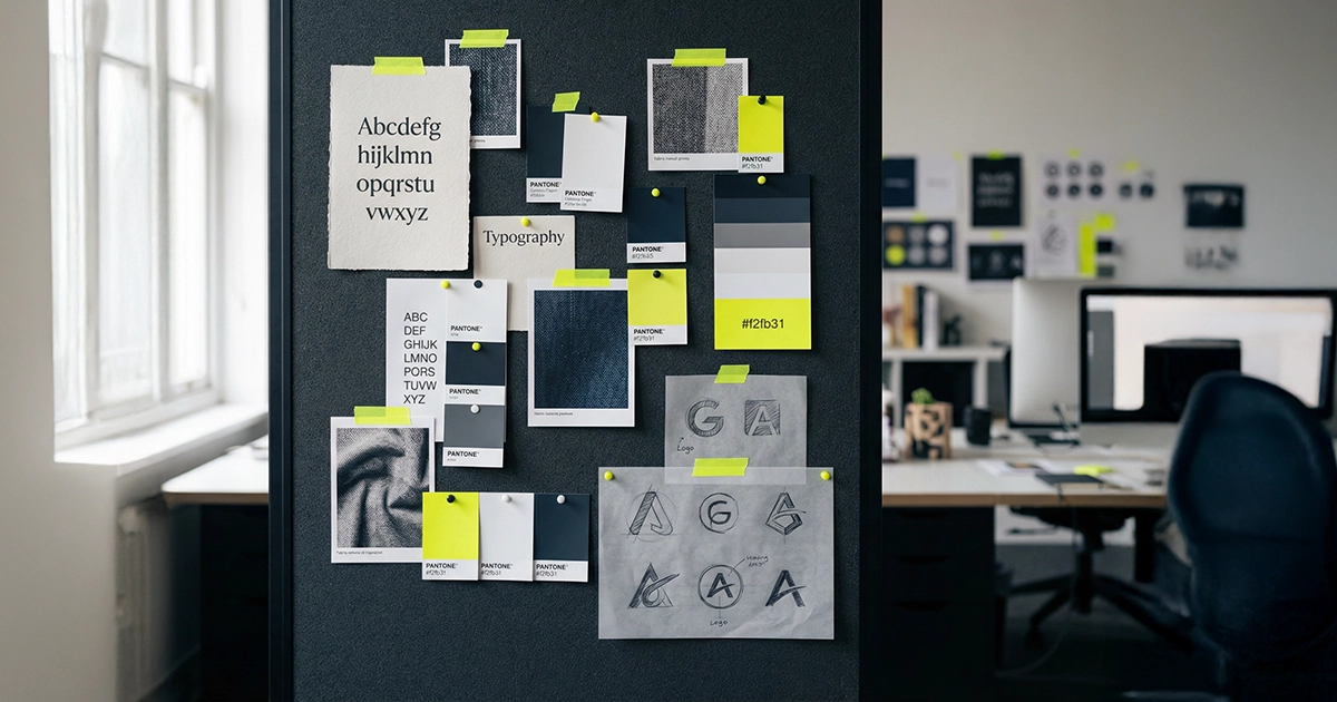
Design Systems: Ensure consistency throughout the entire product
A design system is far more than a collection of UI components. It is acommon language between designers and developers, which ensures consistency, efficiency, and scalability. Companies like Airbnb, Shopify, and Deutsche Telekom have used Design Systems to achieve theirDevelopment time reduced by 30-50%.
The components of a design system
1. Design Tokens
Design Tokens are thesmallest unitsA design system includes colors, font sizes, spacing, animation speeds, and shadows. These are defined centrally and can be automatically translated into code.
- Color tokens: Primary, Secondary, Error, Success, Warning + gradations
- Spacing tokens: 4px, 8px, 12px, 16px, 24px, 32px, 48px, 64px
- Typography Tokens:Font family, font size, line height, font weight
- Shadow Tokens:Elevation levels for depth and hierarchy
2. UI Component Library
Reusable components such as buttons, forms, maps, navigation, and modals. Each component has:
- Variants: Primary, Secondary, Outline, Ghost
- Conditions: Default, Hover, Active, Disabled, Loading, Error
- Sizes:Small, Medium, Large
- Documentation:When and how the component is used
3. Pattern Library
Recurring UX patterns such as login flows, onboarding sequences, search functions, or checkout processes. Patterns aremore complex than individual componentsand describe the interaction of several elements.
4. Guidelines and Principles
Rules for tone of voice, visual language, iconography, and accessibility. These guidelines ensure that even new team members create consistent designs.
Tools for Design Systems
- Figma:The standard for design system creation and component libraries
- Storybook:Isolated development and documentation of UI components
- Tokens Studio (formerly Figma Tokens):Export Figma design tokens directly to code
- Chromatic:Visual testing for components detects unintended visual changes.
Introducing a design system: A pragmatic approach
For most Austrian companies, a complete design system like those of Google or Atlassian is essential.oversizedStart pragmatically:
- Inventory:Collect all existing UI elements from your website or app.
- Consolidation:Identify inconsistencies (e.g., 7 different button styles)
- Define core set:Identify the 15-20 most important components
- Documentation:Create simple documentation in Figma or Storybook
- Iterate:Expand the system gradually, based on the team's needs.
A pragmatic design system for an SME can be found in2-4 weeksbuilds up and then saves with each new feature20-40% development time.
UX Writing: Microcopy that converts
UX Writing -- also known as Microcopy -- encompasses all text elements in a user interface:Button labels, error messages, tooltips, placeholder texts, confirmation messages and navigation labelsThese short texts have a surprisingly large impact on the conversion rate.
Why microcopying is so important
A study by Google shows that well-formulated error messages...Form completion rate increased by up to 22%This can increase it. The reason: Microcopy reduces uncertainty, answers questions at the right moment, and guides users safely through complex processes.
The principles of good microcopying
1. Clarity before creativity
A button saying "Try it for free now" converts better than one saying "Let's go." Users need to understand immediately what will happen when they click it.
2. Formulate in a benefit-oriented manner
Not: "Submit" -- Better: "Request a quote"
Not: "Register" -- Better: "Start for free"
Not: "Subscribe to newsletter" -- Better: "Get SEO tips"
3. Address fears
AddAnxiety relieverAdd near forms and buttons:
- "No credit card required"
- "Cancellable at any time"
- "Your data will be transmitted in encrypted form"
- "We will not share your email address."
4. Human and empathetic
Error messages shouldHelp, don't blame:
- Bad: "Invalid entry in field 3"
- Good: "Please enter a valid email address, e.g. name@company.at"
Microcopying for the Austrian market
Specific rules apply in the DACH region and especially in Austria:
- Formal:Use the formal "Sie" (you) in business contexts. The informal "Du" (you) is only appropriate for explicitly young, casual brands.
- Local formulations:Use "email address" instead of "email", "mobile phone number" instead of "mobile number".
- GDPR-compliant texts:Checkbox text in forms must comply with legal requirements, but still be understandable.
- Currency and formats:"EUR" or Euro symbol, date format DD.MM.YYYY, telephone with country code +43
Test microcopy
Test different variations withA/B tests:
- Button text: "Request now" vs. "Get a free quote"
- Form labels: "Company" vs. "Business" vs. "Company Name"
- Error Messages: Technically vs. Humanly Formulated
- CTA texts: Active vs. passive, short vs. long
Even small text changes can increase the conversion rate by5-15%Change things up. Invest time in optimizing your microcopy – the ROI is enormous.
Accessibility in UX Design: Accessibility from the start
Accessibility (or a11y for short) is not only an ethical obligation, but is increasingly becoming a necessity.legal requirement. The Accessibility Act (BaFG), which will apply in Austria from June 2025, obliges companies to design their digital products and services to be barrier-free.
Who benefits from accessibility?
- 15-20% of the populationliving with a form of disability
- Older users(over 65) often have limitations in vision, motor skills or cognition.
- Situational disabilities:Users with a broken arm, in noisy environments or in strong sunlight
- All usersbenefit from improved readability, clear navigation and logical structure
Understanding the WCAG guidelines
The Web Content Accessibility Guidelines (WCAG) 2.2define three levels of conformity:
- Level A:Minimum requirements (e.g. alt text for images, keyboard navigation)
- Level AA:Standard for most websites (e.g., color contrast 4.5:1, form labels)
- Level AAA:Highest level (e.g. sign language videos, contrast 7:1)
The BaFG is based onWCAG 2.1 Level AA-- this is the minimum requirement for Austrian companies.
The most important accessibility measures
Visually:
- Color contrast:At least 4.5:1 for normal text, 3:1 for large text. Check with the WebAIM Contrast Checker.
- Not just color:Never use color as the sole distinguishing feature (e.g., additionally mark red error messages with an icon and text).
- Scalable texts:The website must remain fully usable at 200% zoom.
- Focus indicators:Visible outlines for keyboard users when elements are focused.
Structurally:
- Semantic HTML:Use '<nav>', '<main>', '<article>', '<aside>' instead of generic '<div>' elements.
- ARIA labels:For interactive elements that have no visible text (e.g., icon buttons)
- Heading hierarchy:Logical sequence H1 > H2 > H3 without jumps
- Landmark Regions:Mark main areas of the page with ARIA landmarks
Interactive:
- Keyboard navigation:All functions must be accessible via keyboard (Tab, Enter, Escape, arrow keys)
- Skip links:A hidden link at the top of the page that jumps directly to the main content.
- Forms:Each input field needs an assigned label; error messages must be clear and understandable.
- Timeouts:Users must be able to extend or disable time limits.
Accessibility testing tools
- axe DevTools(Browser extension): Automated WCAG check directly in the browser
- WAVE (Web Accessibility Evaluation Tool): Visual overlay with accessibility issues
- Screen Reader Testing:Test with VoiceOver (macOS), NVDA (Windows) or TalkBack (Android)
- Lighthouse Accessibility Score:A first overview, but it only covers about 30% of the WCAG criteria.
Integrate accessibility into the design process
Accessibility isno subsequent add-on, but must be anchored in the design process from the very beginning:
- User Research:Involving people with disabilities in user research
- Wireframing:Define the focus sequence and landmark structure already in the wireframe.
- Design:Set contrasts, font sizes and touch targets (at least 44x44px).
- Development:Implement semantic HTML, ARIA attributes, and keyboard interaction
- Testing:Automated tests AND manual tests with assistive technologies
UX metrics: Measuring the success of UX measures
UX design is not an art whose success is subjectively judged—it is adata-driven disciplineThe right metrics help you demonstrate the ROI of your UX investments and make informed design decisions.
Behavior-based metrics
Task Success Rate
The percentage of users who successfully complete a specific task. Measure this for critical flows such as registration, checkout, or contact request.
- Good value:Over 85% for simple tasks, over 70% for complex tasks
- Measurement method:Usability testing with defined tasks, funnel analysis in analytics
Task Completion Time
How long does it take users to complete a task? Compare the actual time with the estimated time.expected ideal timeLarge deviations indicate UX problems.
Error Rate
How often do users make mistakes while operating the device? Track:
- Form validation errors per field
- Rage clicks (clicks on non-clickable elements)
- Navigation setbacks (indicate orientation problems)
Attitude-based metrics
System Usability Scale (SUS)
A standardized questionnaire with 10 questions, which...Perceived ease of usemeasures on a scale of 0-100.
- Under 50:Serious usability problem
- 50-68:Below average
- 68-80:Above average
- Over 80:Excellent
The SUS is particularly valuable because itcomparableis -- You can compare your scores with industry benchmarks and previous versions.
Net Promoter Score (NPS)
"How likely are you to recommend our product?" (0-10). The NPS measures theOverall satisfactionand correlates strongly with user retention.
- Promoter (9--10):Enthusiastic users
- Passive (7--8):Satisfied, but not loyal users
- Detractors (0--6):Dissatisfied users
- NPS = % Promoters - % Detractors
A good NPS for digital products in the DACH region is...+30 to +50.
Customer Effort Score (CES)
"How easy was it to complete your task?" (1-7). The CES measures theperceived effortand is a strong predictor of customer loyalty. Low values (=low effort) correlate with higher reuse and lower churn.
Business metrics with a UX focus
Link UX metrics with business metrics to understand theROI of UX investmentsto prove:
- Conversion Rate:What percentage of visitors become customers?
- Cart Abandonment Rate:How many users abandon the checkout process? (Industry average: 65-70%)
- Support ticket volume:Fewer UX problems = fewer support requests
- Customer Lifetime Value (CLV):Good UX increases customer loyalty and therefore customer value.
- Time to Value:How quickly do new users experience their first "aha" moment?
Building a UX measurement framework
Implement a structured measurement framework:
- Define goals:What specific UX improvement measures should the measure implement? (e.g., increase the checkout completion rate from 30% to 40%)
- Measure baseline:Where do you stand today? Document the current state before the change.
- Implement tracking:Setting up event tracking in Google Analytics 4, Hotjar or Mixpanel
- Evaluate regularly:Monthly UX reports with trend analysis
- Iterate:Optimize based on the data and measure again.
Practical tip:Create aUX DashboardUse the 5-8 most important metrics and review them every two weeks. Combine quantitative data (analytics) with qualitative insights (usability tests, user feedback) to get a complete picture.
Collaboration in the UX process: Involving stakeholders and processing feedback
Outstanding user experience design never emerges in a vacuum. The best digital products are the result of structured collaboration between UX designers, developers, product managers, marketing teams, and—crucially—the stakeholders within the company. Especially in Austrian companies, where decision-making processes are often hierarchical, a well-thought-out collaboration process is the key to project success.
Why stakeholder engagement determines success or failure
Studies show that UX projects where stakeholders are involved early and continuously are more successful.47 percent higher success rateThis differs from situations where the design team works in isolation. The reason is obvious: Stakeholders bring business-critical knowledge that no desk research can replace.
- Business goals and prioritiesOnly the specialist departments know which conversion goals are truly crucial.
- Customer understandingSales teams have firsthand knowledge of the most common objections and questions from their target audience.
- Technical framework conditionsThe IT department can point out limitations early on, before costly redesigns become necessary.
- Compliance and regulationEspecially in the DACH region, GDPR and industry-specific regulations play a central role.
Stakeholder mapping: Identifying the right people
Before scheduling your first workshop, you should conduct a systematic stakeholder mapping. Categorize all participants according toInfluence and interest:
- High influence, high interest(e.g., management, product owner): These individuals must be actively involved in decisions. Schedule regular coordination meetings and explicitly obtain their approval for critical design decisions.
- High influence, low interest(e.g., IT management, legal department): Proactively inform these stakeholders about progress and potential impacts on their areas. Detailed design reviews are less useful here.
- Low influence, high interest(e.g., customer service, content team): Use their expertise as a valuable source of input for user insights without overburdening them with decision-making responsibility.
- Low influence, low interest(e.g., external partners): Keep this group informed with summary updates.
Structured feedback methods for efficient voting
Unstructured feedback is the biggest enemy of a productive UX process. When stakeholders spontaneously discuss colors, layouts, and text in a meeting, it rarely leads to usable results. Instead, rely on proven methods:
Design critiques instead of free discussionGive each feedback session a clear structure. Define in advance the questions you need feedback on. For example: 'Does this layout support user navigation to the contact form?' instead of 'What do you think of the design?'
Asynchronous feedback with annotation toolsTools like Figma, Miro, or InVision allow stakeholders to comment directly on the design. This saves meeting time and delivers more precise feedback. Use aFeedback deadline of a maximum of 48 hours, so as not to delay the process.
Dot voting for prioritizationWhen multiple design options are under consideration, give each stakeholder a limited number of votes. This prevents endless discussions and makes preferences transparent.
Processing feedback and resolving conflicts
Not all stakeholder feedback is equally relevant, and conflicting feedback is more the rule than the exception. Develop a clear framework for processing feedback:
- CategorizeThey categorize each piece of feedback as ‘data-driven’ (based on user research or analytics) or ‘opinion-based’ (personal preference).
- PrioritizeThey generally value data-driven feedback more highly than subjective opinions.
- DocumentThey record every design decision and its rationale in a Decision Log.
- CommunicateBe transparent about why certain proposals are not implemented – this creates trust and understanding.
In conflicts between stakeholders, the principle ‘User first, business second, opinion last"Proven. If you can support a design decision with user data, this evidence should carry more weight than individual tastes. If reliable data is lacking, plan a quickA/B test or usability testone, in order to objectively base the decision.
Workshop formats for productive collaboration
For Austrian companies, these tried and tested workshop formats are recommended:
- Design Sprint(5 days): Ideal for complex problems where stakeholders from different departments jointly develop and test a prototype.
- Stakeholder interviews(60 minutes per person): Structured individual meetings at the beginning of the project to identify expectations, goals and potential conflicts early on.
- Co-creation workshops(3–4 hours): Collaborative idea development using Post-it notes, sketches, and rapid prototyping – particularly effective when subject matter experts and designers work together as equals.
- Review sessions(90 minutes): Regular presentations of the current design status with structured feedback based on predefined criteria.
The key lies in viewing stakeholders not as a disruptive factor, but as an asset.valuable source of knowledgeConsider this. If you set up the collaboration process correctly, you will benefit from deeper insights, higher acceptance, and ultimately a better product for your users.
Conclusion: UX Design as a Competitive Advantage
Good UX design is not a cost factor – it's an investment with a measurable return. In a market where products are becoming increasingly interchangeable, user experience is often the decisive differentiator.
The most important steps:
- Understand your users (Research, Personas, Journey Maps)
- Structure before you start designing. (Wireframes, information architecture)
- Test prototypes, not discuss designs(Usability Testing)
- Iterate based on data(Analytics, testing results)
- Think mobile-first (touch targets, performance, context)
Do you want to take the user experience of your website or app to the next level? At GoldenWing, we guide you through the entire UX process with over 3 years of experience.Contact usfor a free initial consultation.